Earth-scale AI pipelines for Earth Observation (Part 1: Data Curation)
The rate of prototyping the Fused App Builder unlocks is unrivaled. Recently I used it to create a sophisticated prototype app to accelerate my ML workflow. You can follow along by using the "Cube Factory" app I built.
Introduction
The field of AI stands to revolutionize Earth Observation (EO), unlocking unprecedented insights from satellite imagery. This article shows how you can leverage multiple layered Fused components:
- Serverless compute
- Highly customizable Fused UDFs
- The Fused App builder
We will harness these resources to curate training datasets that can streamline deep learning workflows. As a working example, we will demonstrate land use inference and crop detection with multispectral satellite imagery.
EO data offer valuable insights for predicting the impact of severe weather events, quantify environmental changes, and tracking natural disasters. Various sectors stand to benefit, from urban planners to finance gurus in commodities and futures trading. AI techniques combined with geospatial data offer insights into short and long term dynamics on Earth, such as deforestation, wildfire management, and agricultural land use.
However, one of the biggest bottlenecks of processing EO data is the time spent on data engineering, holding back researchers from harnessing the full potential of their data.
In this article, we'll demonstrate the Fused platform in effortlessly curating training data for machine learning model development. The derived model can differentiate between developed areas, forests, open lands, vineyards, and fields of corn and soybean.
Here is a screenshot of the simple Python app built to make the data curation and visualization process relatively effortless for the geospatial data scientist. Every control and widget setting in this front end you see here modifies how the data is transformed in the back end by Fused UDFs, one for each data asset available, and produces the map visualizations you see in the viewport, with spot analytics in the sidebar.
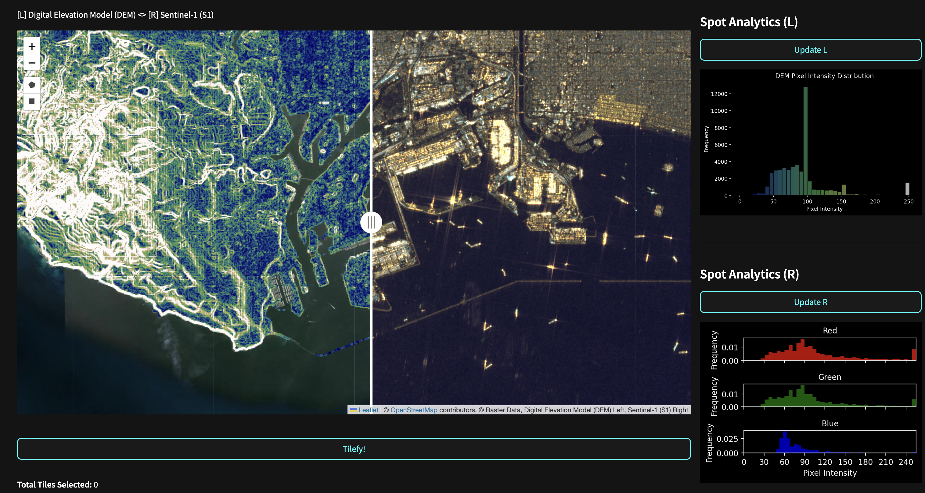
Later, as part of the workflow, I will demonstrate spatial querying that will allow us to choose custom regions on which to train a model - simply by outlining polygons on a map.
Article structure
This is the first of a 3 part series that will show how Fused can be used in querying, processing/ETL, visualization, and inference tasks across stages of the model development lifecycle:
- Data curation: Prepare and generate training images and masks.
- Model training: Feed curated data into a state-of-the-art multiclass segmentation model.
- Model Inference: Establish generalization limits by evaluating model performance on user-selected holdout regions from different locations and timeframes.
The role of Fused
Fused is a platform that simplifies the engineering challenges involved in building data workflows for Earth Observation (EO) analysis. Its key features for curating training data include:
- Python User Defined Functions (UDFs): UDFs define transformations on data and can easily be called with parameters and across different areas of interest.
- Remote Accessibility: UDFs can be called from anywhere via HTTP requests, delivering data exactly where it's needed without the need to store or transfer large datasets.
- Parallel Execution: UDFs can run in parallel, processing thousands of data chips per minute for efficient scaling.
- UDF Workbench: The UDF Builder provides instant feedback during algorithm development, allowing users to visually inspect the resulting data chips on a dynamic map. Any changes are immediately deployed upon saving.
The synergy of these Fused components enables researchers to dedicate more time to experimentation and analysis rather than data engineering.
“Ultimately we want Data Scientists to be able to deliver autonomously — without operational reliance on a dedicated engineering team, especially given the unwieldy scale and volume of earth observation data."
Problem overview
An example workflow addresses the challenge of developing a model to categorize and quantify agricultural land use across the continental U.S. with multispectral satellite imagery. This task involves complex multi-class segmentation with several key challenges:
- Image variability: Satellite images can vary in resolution, quality, brightness, and cloud cover. Crop reflectivity fluctuates across regions and growing seasons, impacting data selection and algorithm design.
- Engineering limitations: Traditional approaches restrict the number of iterations researchers can perform to design and tune a model.
- Increasing data complexity: The growing number of spectral bands and satellite sources available requires a systematic approach to selecting an index combination.
By automating engineering processes such as image chipping and source harmonization (time, space, and projection) to prepare training data, researchers can have more iteration cycles as they define spectral indices and band combinations that generalize images.
Input datasets
Our example model will use 3 bands of Sentinel 2 satellite imagery as input to our ML model to predict a CDL crop mask value - the target layer. We will leverage a Fused “Cube Factory“ app we built to generate the chips or “datacubes" that contains both inputs and target. Thinking bigger, there are multiple fused assets which can take the role of input or target. A strength of the fused Cube Factory app is the implicit matching of data in both spatial and temporal dimensions. A further goal of this blog is to demonstrate how easily custom apps like this one can be created and shared on the Fused App Builder.
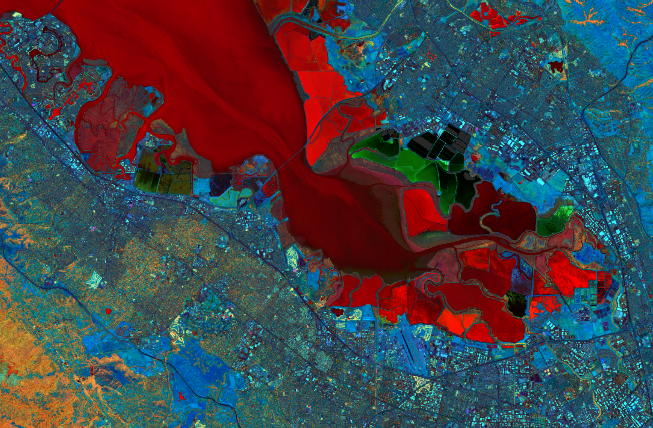
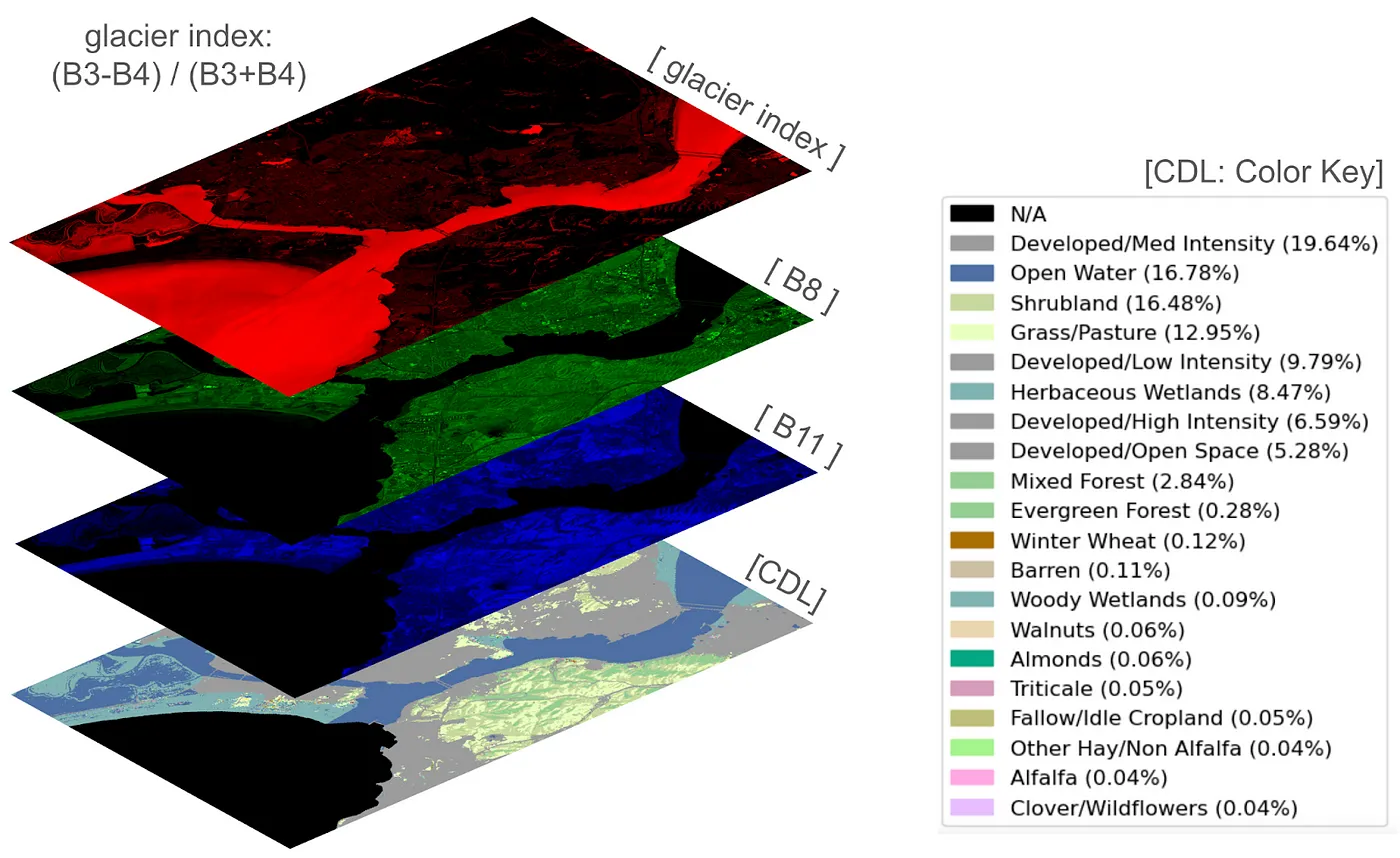
- Sentinel 2 offers 13-bands of 10 meter resolution imagery with broad temporal and spatial coverage. We chose the Glacier index as the Pseudo Red Channel and Channels 8 (NIR) and 11 as Green and Blue, respectively (image above).
- Land Use Land Cover (LULC) dataset provides a global land cover classification
- Digital Elevation Model (DEM) dataset provides terrain elevation
- Sentinel 1 offers HV and VV polarization bands of 10 meter resolution - active imaging data derived from SAR with broad temporal and spatial coverage and a 6 day cadence.
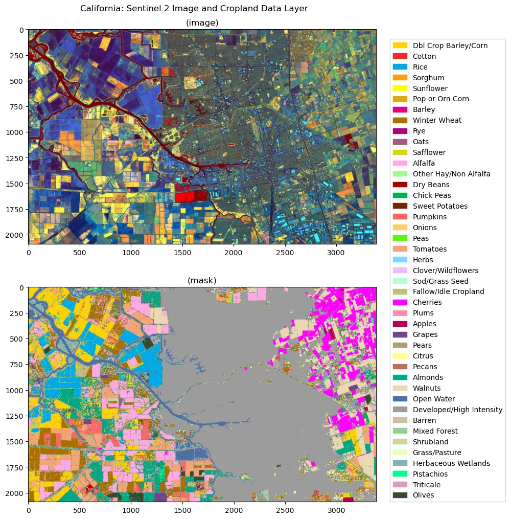
- The USDA Cropland Data Layer (CDL) dataset maps individual pixels of 30m resolution to hundreds of crops and land types like 'soybean' and 'corn', or even 'pumpkins' and 'cherries'. Below you can see a hyperspectral image of central california, and the dominant crop and land classes in the associated CDL image below.
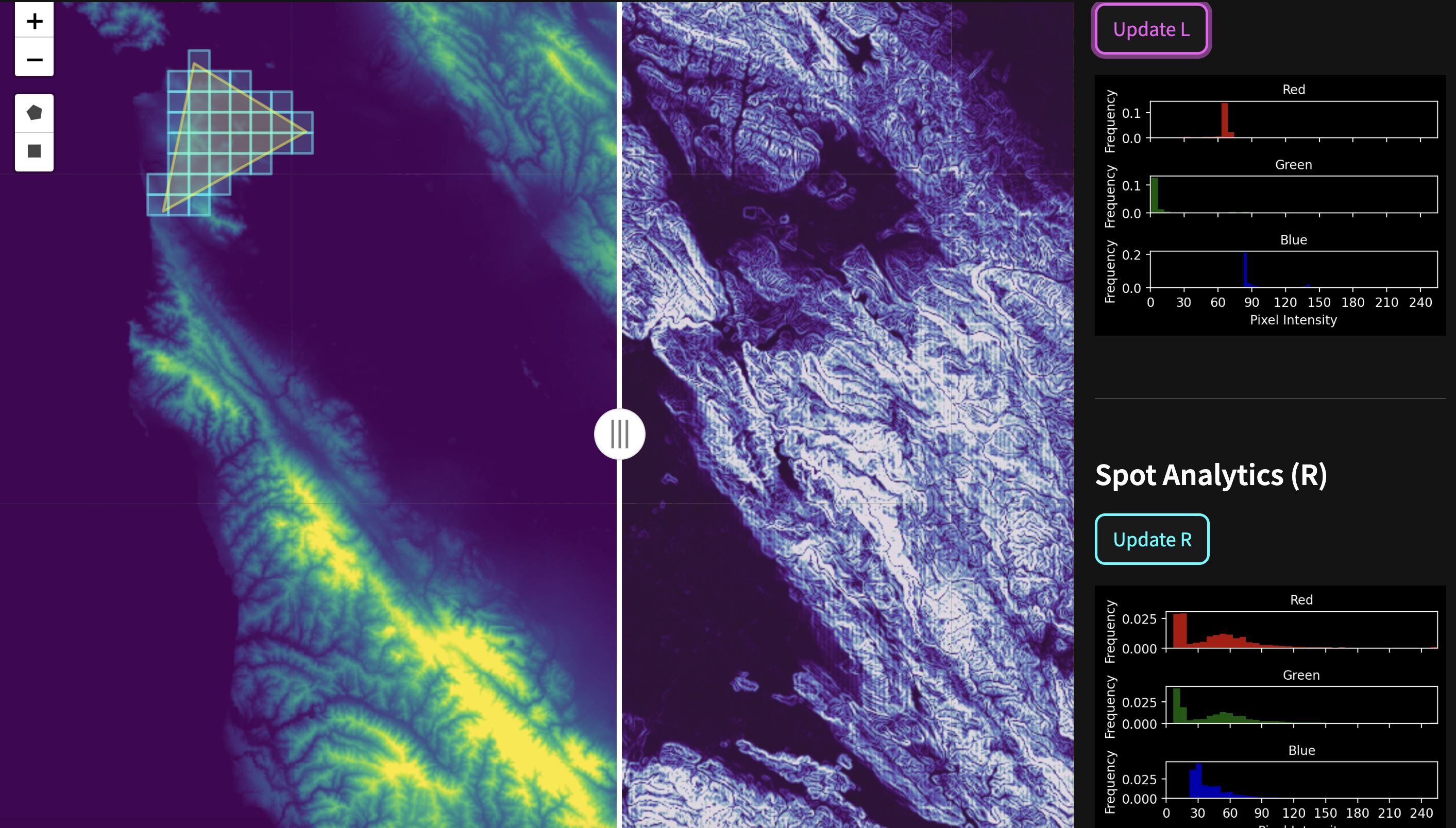
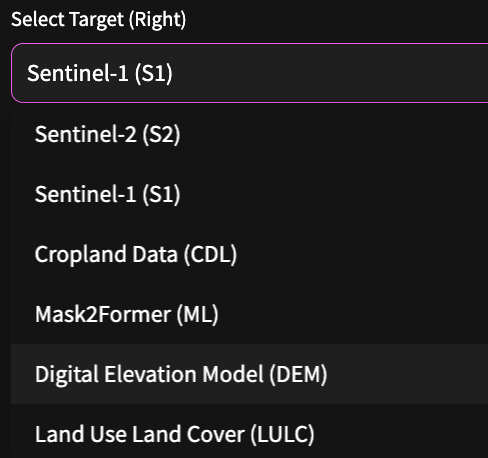
An additional flexibility offered by the app is the variety of Fused assets that can be called as either inputs or targets. For the viewport visualization we set the left side of the split map as the input layers and the right side as the targets.
Returning to our chosen target, the CDL dataset, it contains up to 256 named crop classes (see: CDL_names_codes_colors), we grouped these together into 10 superclasses to simplify our task.
- Background/Missing BG
- Wheat WH
- Corn CO
- Soybeans SB
- Grass/shrub/open lands OL
- Forest and wetlands FW
- Open water OW
- Developed DV
- Other agricultural (catch-all) OA
- Other/barren OT
{'BG': 0, 'OW': 1, 'DV': 2, 'CO': 3, 'SB': 4, 'WH': 5, 'OA': 6, 'FW': 7, 'OL': 8, 'OT': 9}
Data curation workflows
The Mask2Former model we will employ for this exercise is optimized for 3 channel RGB images, so we'll use Fused UDFs to create a 4 layer datacube, three inputs from Sentinel 2 and one CDL layer as target. Then, we'll call them across a set of tiles to create the training dataset.
For this example, I selected 3 bands to predict with: glacier index (red-green normalized difference index) is on top, and bands 8 and 11 from Sentinel palette in the middle. The CDL mask at the base of the datacube has pixel values that correspond to major crop classes.
Create datacube
The first 3 channels of the datacube encode Sentinel 2 bands as RGB false color channels, and the fourth channel encodes the CDL mask are associated with the following 3 UDFs:
- Choose Right and Left map layers from the Fused asset collection.
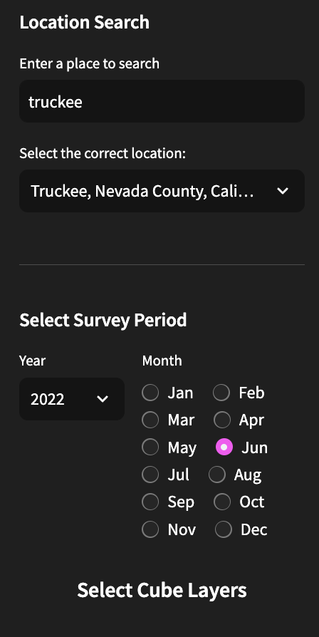
- Choose a Survey Period and location using the left side pop-out menu.
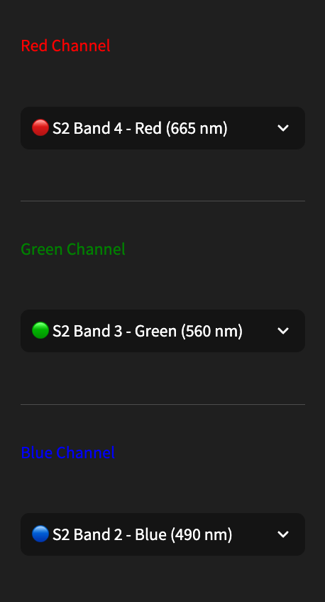
- If using Sentinel 2 - select 3 of the available 13 bands or one of 6 normalized difference indices.
- If using digital elevation model as input or target (left or right map side), choose whether terrain, or gradient modes, choose scale parameters, and choose a colormap for visualization.
- Draw polygons on the map.
- Press “Tilefy!" to add tiles overlapping the current polygon to the tile bank. The mercantile library determines the set of individual map tiles, at a chosen zoom level.
- Finally hit Export to create a parquet record of your chosen datacube collection along with survey time period and all relevant metadata. This will be saved to your account's S3 bucket in the Fused File System - if you have one.
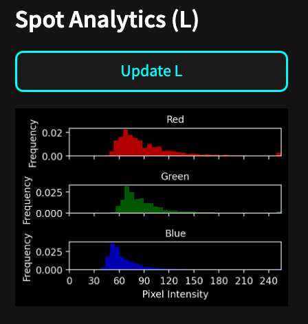
- There is an analytics sidebar on the right that is context specific and provides histograms for the left and right maps based on spot reading of the central tile of the viewport.
Model training
To train a model on our datacube we downloaded the Mask2Former model from Hugging Face and fine-tuned it on the 10,000 datacubes of 240x240 pixels (resulted in ~1GB of training data). This can be done locally on a GPU machine, or in the cloud on colab or paperspace gradient (now digital ocean). In our next post we will demonstrate how to train ML models natively on the Fused platform.
Model Hosting
The final model is available on a dedicated Inference endpoint hosted by Hugging Face, and accessed via a API call through a custom Fused UDF. It is available in the Cube Factory app for inspection as the Mask2Former ML layer. This allows a qualitative side by side comparison with the CDL layer. The model was trained on July imaged crops in the midwest among other areas, here is how it performs vs ground truth near Jacksonville Illinois. The left side shows the target layer and the right side shows the model prediction.
Conclusion
This post showed how Fused makes it easy to generate training datasets. It gave a practical example of how with Fused UDFs the data loading, data preprocessing, and data loading happen behind an HTTP endpoint, enabling easy data retrieval from anywhere. There's no need to pre-compute, store preprocessed data, or manually generate tiles, as Fused dynamically generates data for the specified tiles using simple HTTP calls.
This approach offers several advantages to build customized training datasets. Since data generation is on demand and gets cached, a data scientist can quickly iterate, adjusting spatial or temporal parameters without worrying about managing storage or running jobs to generate datasets. The flexibility to load data that is needed, when it's needed, accelerates experimentation and refinement of models.
To replicate this work for your own AOIs, you can try out the Cube Factory app yourself or run the underlying UDFs on your own Fused Workbench environment. Please feel free to contact me on LinkedIn.
References
- [1] L. L. Zhang, S. Dhaka, et al., Building a Crop Segmentation Machine Learning Model with Planet Data and Amazon SageMaker Geospatial Capabilities (2023)
- [2] S. Hamdani, Supervised Wheat Classification Using PyTorch's TorchGeo — Combining Satellite Imagery and Python (2023)
- [3] Sentinel-2 Mission Overview (2023)
- [4] Digital Elevation Model (DEM) Data (2023)
- [5] ESA WorldCover 10m 2020 V100 (2023)
